Want a super stylish wedding look? Avoid these color palette blunders.
Choosing a wedding color palette is like picking the perfect outfit—it sets the tone for your big day and reflects your personal style. Much like trying to match polka dots with stripes, though, picking the wrong palette can be a recipe for disaster.
Whether you’re going for a classic look or something more offbeat, your wedding color scheme should tie everything together seamlessly. The trouble is, there are lots of sneaky hidden pitfalls that can derail your painstaking planning. So if you’re ready to avoid those cringe-worthy color combo catastrophes, grab a cup of coffee (or a mimosa), and let’s get the lowdown on the mistakes to avoid.
First, let’s look at some advice on finding the right colors for different wedding themes.
Color palette ideas for popular wedding themes
Choosing a color palette for your wedding is about a lot more than picking pretty shades—it’s about setting the mood and complementing your overall aesthetic. In other words, your wedding color scheme tells a story. So, here’s a handy guide to the perfect palette for five popular wedding themes.
Royal wedding theme
Color palette: Regal jewel tones
For a royal-themed wedding, think opulence and grandeur. In other words, jewel tones are your best bet here. Imagine deep, rich hues like emerald green, royal blue, and ruby red. These colors evoke a sense of luxury and majesty fit for a king and queen. Accentuate with gold or silver accents to enhance the regal feel, and make sure that you incorporate gold into elements like table settings and invitations.
Why it works: Jewel tones offer depth and richness, perfect for creating a lavish atmosphere. Metallic accents like gold add a touch of extravagance that complements the royal theme beautifully.
Art Deco wedding theme
Color palette: Classic black, white, and gold
Picturing a vintage 1920s wedding? Then channel your inner flapper girl with a color palette that reflects the glamor and sophistication of the era. Classic black and white with splashes of gold are ideal for capturing the essence of the Jazz Age. Think art deco patterns and vintage-inspired invitations with period typography. You can use black and white for your decor and attire, while gold can be introduced through details like tableware and floral arrangements.
Why it works: The black and white combination exudes timeless elegance, while gold accents add a touch of the opulence that defined the 1920s. This palette is perfect for a Gatsby-inspired celebration filled with glitz and glamor.
Fairytale wedding theme
Color palette: Soft pastels and enchanted greens
For a fairytale theme, think dreamy and romantic wedding colors that conjure up a magical atmosphere. Pastel shades like blush pink and lavender paired with enchanted greens will create a whimsical feel. You can use these colors in everything from your floral arrangements to your table linens, as well as your bridesmaid dresses and bouquets. Incorporating delicate accents like fairy lights or sparkles will enhance the fairytale vibe.
Why it works: Soft pastels and greens bring an ethereal quality to your wedding, making it feel like a scene straight out of an enchanted forest. This combination is gentle and romantic, perfect for creating a storybook ambiance.
Boho wedding theme
Color palette: Earthy tones and wildflower hues
For a boho wedding theme, embrace Mother Earth with natural colors. Think warm, muted shades like terracotta, rust, mustard yellow, and sage green. Pair these with the vibrant, free-spirited hues found in wildflowers, such as deep purples and bright oranges. This palette works well with natural textures and materials, like wood and linen, and can be reflected in your floral arrangements and table settings.
Why it works: Earthy tones and wildflower hues capture the essence of bohemian style and back-to-nature vibes. Plus the eclectic nature of this color palette is as free-spirited as you can get.
Minimalist wedding theme
Color palette: Monochromatic neutrals
For a minimalist wedding, less is definitely more. So choose a monochromatic color scheme with varying shades of neutral colors such as white, ivory, beige, and soft gray. This palette creates an elegant and understated look that can be reflected in wedding attire and floral arrangements, for instance, an all-white lily bouquet.
Why it works: A monochromatic neutral palette aligns perfectly with minimalist aesthetics, emphasizing simplicity and elegance. The subtlety of neutrals ensures that the overall look is clean and refined, ideal for a modern and understated wedding.
Avoid these 17 wedding color palette blunders
1. Ignoring your venue’s existing color scheme
Your wedding venue is like a canvas that’s already partially painted, which means that ignoring the existing color scheme can result in a clash that’s about as appealing as peppermints on pizza. Whether your venue has vibrant walls or neutral tones, consider how your chosen palette will complement or contrast with the space. If you’re hosting at a venue with a bright, bold decor, you might want to opt for softer hues to avoid a visual overload.
2. Choosing colors that clash with the dress
Your wedding dress should be the star of the show, not a clashing mess. Also—it’s a myth that “white goes with everything”. For instance, if you’re sporting a classic white gown, avoid pairing it with colors that create a harsh contrast, like neon pink or electric blue. Instead, go for softer tones that enhance the elegance of your gown, such as pastels or muted shades.
3. Overcomplicating with too many colors
More isn’t always merrier when it comes to wedding colors. Going overboard with a palette that features every color of the rainbow can result in a chaotic and overwhelming aesthetic. Stick to a primary color and one or two complementary shades to keep things visually appealing and cohesive. If you’re tempted to include multiple colors, then use them in accents rather than as main elements.
4. Overlooking seasonal wedding colors
Choosing colors that don’t align with the season can make your wedding look out of place, for instance, a bright summer palette might look strange in a winter wonderland setting. Instead, embrace seasonal colors that reflect the time of year. Think warm golds and rich reds for a fall wedding, or cool blues and greens for a spring affair. This ensures your palette feels naturally integrated into your wedding setting.
Selecting colors that don’t correspond with the season can make your wedding look disjointed. So celebrate the season by making sure your colors align with the time of year.
5. Not factoring in lighting
Lighting can drastically affect how colors appear, meaning that a color that looks vibrant in daylight might turn dull under dim lighting. So make sure to test how your chosen colors look under various lighting conditions—in other words, get to know your venue lighting inside-out. For an evening wedding, opt for colors that retain their vibrancy in low light to avoid any dull, washed-out effects.
6. Forgetting about your bridal party’s attire
Your bridal party will be in the spotlight along with you, so it’s crucial that their attire complements your color palette. At all costs, avoid choosing colors that clash with their dresses or suits. Coordinate your bridal party’s outfits with your overall color scheme to ensure a harmonious look for your wedding photos.
7. Being a slave to trends
Just because a color palette is trending or looks amazing on Instagram, doesn’t mean that it’s right for you. Your wedding is a reflection of your and your boo’s personalities, so your choice of shades should express that. Meaning that if you’re both low-key people, bold statements like a neon tangerine color scheme might not be the way to go.
8. Not testing your color combinations
Seeing colors together in a digital palette isn’t the same as seeing them in real life. That’s because colors can look different on screens than they do on fabric swatches. So always test your color combinations with real samples—ideally in your venue setting—to ensure they blend well together. This step can save you from unpleasant surprises on the big day.
9. Overlooking the impact of texture and fabric
Different fabrics can change how colors appear. For instance, velvet and satin can make colors look richer and more intense compared to lighter materials. So consider how your chosen colors will look across various textures, from your bridal gown to the table linens. This will help ensure a unified and sophisticated look.
10. Not considering guest experience
Make sure your color scheme isn’t just beautiful in theory but also creates a pleasant environment for everyone attending. Avoid colors that might be too harsh or distracting and opt for hues that contribute to an inviting and enjoyable atmosphere. Make sure you also avoid having too melancholy a palette. There’s a fine line between moody chic and dreary, so this might be a great time to ask for outside opinions! (But be careful of number 11…)
11. Letting other people dictate your color scheme
It’s natural to seek style advice from loved ones and wedding planners. However, don’t make the mistake of letting others shoehorn you into a palette that you don’t want, just because they think they know what’s best. It’s crucial to follow your heart and express your unique personality—this is your big day, after all.
12. Not considering your own coloring
Make sure that your choice of colors enhances your own unique beauty. For instance, if you have pale skin, then maybe avoid choosing shades that could make you look washed out, such as beige. Remember that your wedding color palette is a backdrop to your gorgeousness, meaning it should show you in your best light.
13. Not planning for color variations
Different shades of the same color can clash if not carefully planned. If you’re using multiple shades of one color, make sure they harmonize rather than compete. A good way to ensure this is to use a color wheel or consult with a color expert to find variations that work well together.
14. Overlooking the impact on wedding photos
Colors can look different in photos than they do in person. Bright colors might be too intense, while soft pastels could fade. Consider how your color palette will appear in your wedding photos and consult with your photographer to ensure your chosen colors translate well into beautiful pictures.
15. Failing to consider your wedding theme
Your color palette should enhance your wedding theme, not contradict it. Whether you’re going for a vintage vibe or a swinging 60s soiree, your colors should complement the overall vibe. Avoid using colors that will clash with your theme and instead choose shades that enhance the ambiance.
16. Ignoring cultural and symbolic meanings
Different colors can have different cultural meanings and symbolism, so make sure to avoid any unintentional offense or confusion. This is especially the case if you and your beau come from different cultural backgrounds. For example, while white might symbolize purity and celebration in some cultures, it has negative connotations in others. Choose colors thoughtfully and respect cultural sensitivities.
17. Not adapting your palette for different design elements
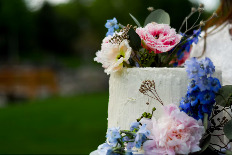
Your color palette should work across all elements of your wedding, from invitations to table settings. So if you’re going for a bold jewel-toned palette, then a wedding cake decorated with pastel roses might not be the way to go. Maintain a consistent and harmonious look by ensuring that your chosen colors can be easily adapted to different aspects of your wedding decor.
Choose your perfect wedding color palette
Avoiding these common color palette mistakes will help ensure your wedding day is as flawless as your love story. From considering the season to checking out the venue in detail, a well-planned color scheme can make all the difference. Here’s to a beautifully coordinated wedding day that’s every bit as perfect as you’ve dreamed.
Looking for more wedding color inspiration? Check out our 7 Most Popular Wedding Colors and 12 Ideas for a Sage Green Wedding Aesthetic.
Ready for your dream wedding in New Jersey?
Il Tulipano in Cedar Grove is perfect for a romantic celebration surrounded by our Italian gardens and piazza. Our venue has just had a makeover and has been praised by New Jersey Bride, The Knot, and Wedding Wire. The Il Tulipano team will treat you like family, so get in touch with us today and let’s plan your dream wedding.
Want more wedding tips? Head over to our blog.